When Halo: Combat Evolved burst onto the gaming scene in 2003, it didn’t just redefine first-person shooters (FPS) – it revolutionized how we interact with video games visually. The game’s icons and banners became the silent narrators of an epic sci-fi universe, guiding players through alien landscapes and intense firefights.
This visual language wasn’t just eye candy; it was the backbone of Halo’s immersive experience, transforming how we perceive and engage with virtual worlds.
Bungie, the masterminds behind Halo, understood that in the heat of battle, a split-second could mean the difference between victory and defeat. They crafted a visual system so intuitive that players could make crucial decisions at a glance.
From the distinctive silhouette of the MA5B assault rifle to the ethereal glow of an active camouflage icon, every visual element in Halo (2003) was purpose-built to enhance gameplay and deepen player immersion.
The impact of Halo’s visual design extended far beyond the game itself. It set new standards for the FPS genre, influencing countless games that followed.
The iconic imagery of Master Chief, the Halo rings, and the sleek Covenant technology became instantly recognizable symbols in gaming culture, transcending the digital realm to become part of the broader pop culture landscape.
The Role of Icons and Banners in Video Games
In the realm of video games, icons and banners serve as more than mere decorations. They’re the unsung heroes of user interface (UI) design, conveying complex information in the blink of an eye.
Halo (2003) elevated this concept to an art form, creating a visual shorthand that became the envy of the gaming industry.
Consider the humble health bar. In Halo, it wasn’t just a bar – it was a dynamic, pulsing shield that gave players instant feedback on their vulnerability.
This clever design choice not only looked cool but also added a layer of tension to every encounter. Players instinctively knew when to push forward or retreat, all thanks to a simple visual cue.
Banners, on the other hand, set the stage for epic battles and intimate storytelling moments alike. Loading screen banners in Halo didn’t just fill time – they built anticipation, offering glimpses of the alien worlds and high-stakes conflicts awaiting players.
These weren’t just static images; they were portals to another universe, priming players for the adventures to come.
The use of icons and banners in Halo (2003) went beyond mere functionality. They became a crucial part of the game’s storytelling toolkit, conveying the scale of the conflict, the alien nature of the Covenant, and the high-tech military aesthetic of the UNSC.
This visual narrative complemented the game’s plot, creating a rich, immersive experience that engaged players on multiple levels.
Icons in Halo (2003)
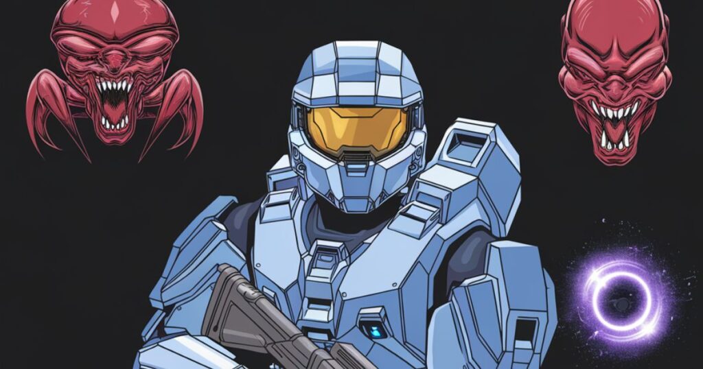
Halo’s iconography struck a delicate balance between futuristic aesthetics and instant readability. Each icon was a mini-masterpiece, conveying function and faction at a glance. The UNSC’s weapons sported clean, military-inspired designs, while Covenant technology pulsed with alien energy.
Key aspects of Halo’s iconic design:
- Silhouette recognition: Each weapon and vehicle had a unique outline, allowing for quick identification.
- Color coding: Faction-specific palettes helped players distinguish friend from foe in multiplayer matches.
- Consistent style: From menus to in-game HUD, Halo maintained a cohesive visual language.
This consistency wasn’t just about looking good – it was crucial for gameplay. In the chaos of multiplayer battles or during intense campaign missions, players relied on these visual cues to make split-second decisions.
The iconic design of the Warthog or the Ghost wasn’t just for show; it helped players quickly assess threats and opportunities on the battlefield.
The design philosophy behind Halo’s icons emphasized clarity and instant recognition. In the fast-paced world of FPS gaming, players needed to process information quickly.
Halo’s icons allowed them to do just that, whether it was identifying a distant vehicle, choosing the right weapon for an encounter, or tracking power-up locations.
Moreover, the icons in Halo (2003) weren’t static elements. Many of them, particularly in the HUD, were dynamic, changing to reflect the current state of the game.
Ammunition counters would deplete, shield indicators would flicker and recharge, and objective markers would pulse to draw attention.
This dynamic quality added life to the UI, making it feel like an integral part of the game world rather than an overlay.
The Significance of Game Icons in Halo: Combat Evolved
Weapon Icons
Halo’s weapon icons were a study in efficient design. The human UNSC weapons, like the iconic MA5B assault rifle, featured sharp, angular designs that spoke to their military origins.
In contrast, Covenant weapons like the plasma pistol boasted smooth, organic shapes that hinted at their alien technology.
These distinctions weren’t just aesthetic choices. They provided crucial gameplay information:
| Weapon Type | Icon Design | Gameplay Implication |
| UNSC | Angular, militaristic | Familiar, reliable |
| Covenant | Organic, alien | Powerful, unpredictable |
This visual dichotomy helped players make informed decisions about weapon selection and tactics, adding depth to the gameplay experience.
The weapon icons also served as a form of visual storytelling. The sleek, advanced look of Covenant weapons communicated their technological superiority, while the rugged, practical design of UNSC weapons reflected humanity’s determination and resourcefulness in the face of a superior foe.
This subtle narrative reinforcement through iconography added layers to the game’s storytelling without the need for explicit exposition.
Power-up Icons
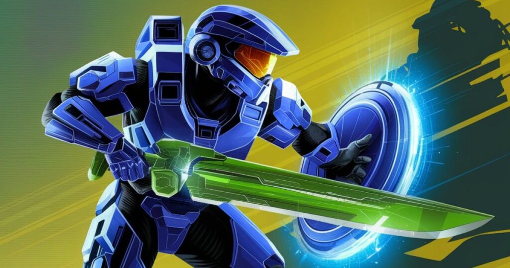
Power-ups in Halo weren’t just game-changers; they were visual treats. The over-shield icon pulsed with protective energy, while the active camouflage icon shimmered with a ghostly transparency.
These dynamic designs didn’t just look cool – they provided instant feedback on the power-up’s duration and effectiveness.
The design of power-up icons went beyond mere aesthetics. They were crafted to be easily distinguishable even in the heat of battle.
The overshield’s blue glow and the active camouflage’s shimmering effect were visible from a distance, allowing players to make quick decisions about whether to grab a power-up or leave it for a teammate.
Moreover, the integration of power-up effects into the player’s HUD and character model further reinforced the impact of these items. When a player picked up an overshield, their entire shield bar would glow blue, providing a constant reminder of their enhanced protection.
Similarly, the active camouflage would render the player’s model semi-transparent, creating a visual spectacle that was both functional and immersive.
Vehicle Icons
From the rugged Warthog to the sleek Ghost, Halo’s vehicles were characters in their own right. Their icons reflected not just their appearance but their functionality on the battlefield.
The Warthog’s icon, with its distinctive turret, instantly communicated its role as a mobile weapons platform. The Ghost’s streamlined icon hinted at its speed and agility.
Vehicle icons in Halo (2003) played a crucial role in multiplayer matches, especially on larger maps. Players could quickly scan the battlefield and identify available vehicles, informing their strategies and movement.
The clear, distinctive designs of these icons meant that even at a distance, players could tell whether they were looking at a nimble Ghost or a formidable Scorpion tank.
The vehicle icons also contributed to Halo’s world-building. The clear distinction between the boxy, utilitarian designs of UNSC vehicles and the smooth, antigravity-based Covenant vehicles reinforced the technological and cultural differences between the two factions.
This visual storytelling through iconography added depth to the game’s universe without the need for explicit exposition.
Faction Icons

The stark contrast between UNSC and Covenant faction icons encapsulated the game’s central conflict. The UNSC’s eagle emblem evoked strength and human determination, while the Covenant’s alien glyphs spoke of mystery and otherworldly power.
In multiplayer matches, these icons became rallying points, fostering team identity and strategic coordination.
Faction icons in Halo (2003) weren’t just for show – they played a crucial role in multiplayer gameplay. In team-based modes, quickly identifying allies and enemies was essential. The clear, distinctive faction icons allowed players to make split-second decisions about who to shoot and who to support.
Moreover, these icons became a part of Halo’s broader visual identity. The UNSC and Covenant logos appeared not just in-game, but in marketing materials, merchandise, and even in the expanded universe of Halo novels and comics.
They became shorthand for the entire Halo franchise, instantly recognizable to fans and symbolic of the epic conflict at the heart of the series.
Also Read: 127.0.0.1:57573 Explained: Unlocking the Power of Localhost in Web Development
The Influence of Banners on Halo’s Atmosphere
Halo’s banners were more than just static images – they were storytelling devices that set the tone for every aspect of the game.
Loading Screen Banners
Loading screens in Halo weren’t just about waiting; they were about world-building. Each banner offered a tantalizing glimpse of the action to come, featuring sweeping vistas of alien landscapes or intense close-ups of Master Chief in action.
These images weren’t random – they were carefully crafted to build anticipation and immerse players in the Halo universe before they even picked up their controller.
The loading screen banners in Halo (2003) served multiple purposes. Firstly, they masked the technical necessity of loading game assets, turning what could have been a boring wait into an opportunity for world-building.
Secondly, they set the mood for the upcoming mission or multiplayer match, priming players emotionally for the experience to come.
These banners often featured iconic imagery from the Halo universe – the mysterious Halo rings, the imposing figure of Master Chief, or the alien architecture of Covenant structures.
By consistently exposing players to these images, Bungie reinforced the visual identity of the Halo franchise, creating a cohesive and memorable aesthetic that would become instantly recognizable to gamers worldwide.
Multiplayer Lobby Banners
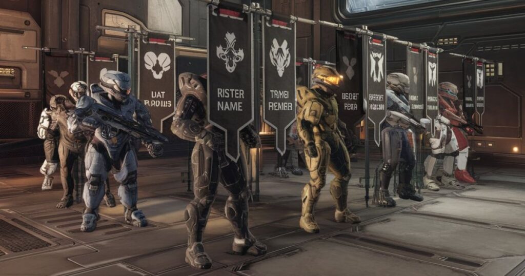
In the multiplayer lobby, banners served a dual purpose. They showcased the epic scale of Halo’s conflicts while also pumping up players for the competitive battles ahead.
The use of dynamic, action-packed imagery in these banners wasn’t just for show – it was a psychological tool to get players in the right mindset for intense multiplayer matches.
Multiplayer lobby banners in Halo (2003) were carefully designed to build anticipation and set the stage for the upcoming match. They often featured dramatic scenes of battle, showcasing the vehicles, weapons, and environments players would soon be engaging with.
This not only looked impressive but also served a practical purpose, giving players a visual preview of the map and assets they’d be interacting with.
These banners also played a role in team building and rivalry. In team-based modes, the lobby banners would often prominently display the emblems of the opposing factions, reinforcing the competitive nature of the match and encouraging players to identify with their team.
This subtle use of visual elements to foster team spirit and competitive drive was another example of Halo’s thoughtful approach to UI design.
Promotional Banners
Halo’s promotional banners were a masterclass in video game marketing. They didn’t just advertise a game; they sold an experience. The iconic image of Master Chief standing before a Halo ring became more than a banner – it was a symbol of the franchise itself, instantly recognizable to gamers worldwide.
The promotional banners for Halo (2003) played a crucial role in establishing the game’s identity in the crowded gaming market. They needed to convey the game’s unique selling points – its sci-fi setting, its epic scale, and its blend of storytelling and action – all in a single, striking image.
The success of these banners in capturing the essence of Halo contributed significantly to the game’s commercial success and cultural impact.
Moreover, these promotional materials set the visual tone for the entire Halo franchise. The style established in these early banners – the use of dramatic lighting, the focus on iconic imagery like the Halo rings and Master Chief’s armor, and the blend of human and alien elements – would continue to influence Halo’s visual identity across multiple games and even into other media like books and films.
In-game Event Banners
During multiplayer matches, event banners served as crucial waypoints. Whether signaling the location of the flag in Capture the Flag mode or marking control points in King of the Hill, these banners were essential for strategic gameplay.
Their design was a perfect blend of form and function, eye-catching enough to spot in the heat of battle but not so obtrusive as to distract from the action.
The in-game event banners in Halo (2003) were more than just markers – they were dynamic elements that responded to the flow of the game.
In Capture the Flag, for instance, the flag banner would change to reflect whether the flag was at its base, carried by a player, or dropped on the field. This real-time feedback was crucial for team coordination and strategy.
Furthermore, these banners contributed to the overall atmosphere of multiplayer matches. The sight of an enemy flag being carried towards a team’s base, marked by a prominent banner, created moments of high tension and excitement.
The banners thus became focal points not just for gameplay, but for the dramatic moments that made Halo’s multiplayer so engaging.
Thematic Banners
Thematic banners tied together Halo’s various game modes and narrative elements. They reinforced the game’s sci-fi military aesthetic, creating a cohesive visual experience whether players were deep in the campaign or battling it out in multiplayer.
This consistency was key to maintaining the game’s immersive qualities across all aspects of play.
The thematic banners in Halo (2003) played a crucial role in maintaining the game’s atmosphere across different modes and menus. Whether players were navigating campaign missions, setting up multiplayer matches, or exploring the game’s options, they were consistently surrounded by imagery that reinforced Halo’s unique blend of military sci-fi and alien mystery.
These banners also served as a form of visual storytelling, offering glimpses into the broader Halo universe. They might showcase different UNSC vehicles, hint at the scale of Covenant fleets, or offer tantalizing views of the Halo rings themselves.
In this way, the thematic banners contributed to world-building, encouraging players to imagine the vast scope of the conflict beyond what was directly shown in gameplay.
How Icons and Banners Contribute to Halo’s Visual Identity
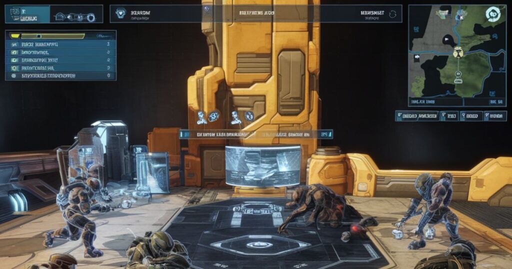
Halo’s icons and banners weren’t just functional elements; they were the building blocks of the game’s visual identity. This cohesive design language became a trademark of the franchise, instantly recognizable to fans and a benchmark for other games in the FPS genre.
Halo: Combat Evolved’s Branding Through Icons
Bungie’s approach to icon design in Halo was revolutionary. They created a unified visual language that extended from the game’s UI to its marketing materials.
The energy sword icon, for instance, became more than just a weapon indicator – it was a symbol of the Covenant’s alien menace, used in promotional materials and merchandise.
The consistency of Halo’s iconography across all aspects of the game and its marketing was a key factor in building a strong brand identity. Players encountered the same visual language whether they were playing the game, browsing its menu screens, or seeing an advertisement in a magazine.
This consistency helped to create a sense of cohesion and familiarity, strengthening players’ connection to the Halo universe.
Moreover, the iconic nature of Halo’s visual elements made them highly memorable and shareable. Fans could easily recognize and reproduce key symbols like the Halo ring or Master Chief’s helmet, facilitating fan art, cosplay, and other forms of community engagement.
This contributed to the growth of Halo’s fan community and helped to cement its place in gaming culture.
Multiplayer Visual Elements
In multiplayer, clear visual communication was crucial. Team colors, objective markers, and player emblems all worked together to create a competitive environment where information was instantly accessible. This clarity of design was a key factor in Halo’s success as a multiplayer phenomenon.
The multiplayer icons and banners in Halo (2003) were designed not just for aesthetics, but for optimal gameplay. In the heat of a multiplayer match, players needed to process a lot of information quickly – the location of teammates and enemies, the status of objectives, the availability of weapons and power-ups.
Halo’s clear, distinctive visual elements allowed players to take in this information at a glance, facilitating fast-paced, strategic gameplay.
Furthermore, the customizable player emblems added a personal touch to the multiplayer experience. Players could choose from a variety of designs to create a unique identifier, adding a layer of individuality to team-based matches.
These emblems appeared on players’ armor in-game and in scoreboards, fostering a sense of identity and ownership within the multiplayer community.
Iconography and Narrative
Halo’s icons didn’t just serve gameplay functions; they told stories. The contrast between UNSC and Covenant designs spoke volumes about the game’s narrative conflict. Human technology was depicted as rugged and utilitarian, while Covenant tech was sleek and otherworldly. This visual storytelling enriched the game’s lore without the need for exposition.
Banners and Future Games
The visual style established in Halo (2003) set the standard for future games in the franchise. As the series evolved, so did its iconography, but the core design principles remained. This visual continuity helped maintain the Halo brand identity across multiple games and platforms.
Halo 2003 Banners and Their Role in Game Atmosphere
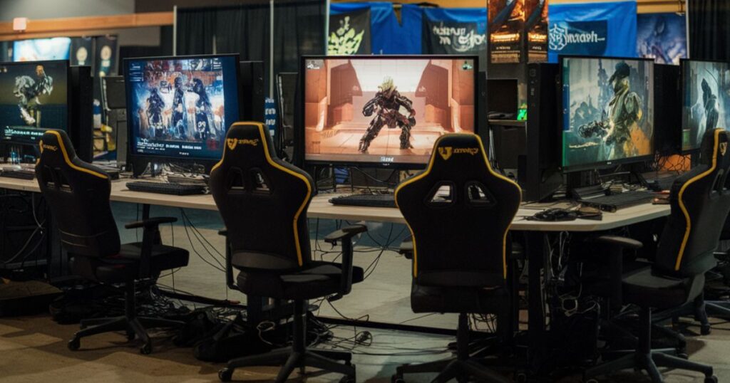
Halo’s banners were more than just marketing tools; they were gateways to the game’s universe. From promotional materials to in-game elements, banners played a crucial role in establishing Halo’s atmosphere and brand identity.
Promotional Banners in Marketing
The marketing campaign for Halo: Combat Evolved leaned heavily on its striking visual design. Promotional banners featured iconic imagery like the Halo ring or Master Chief in dynamic poses, creating instant recognition and building hype. These banners weren’t just advertisements; they were promises of the epic adventure that awaited players.
Multimedia Marketing Campaigns
Halo’s marketing extended beyond traditional print media. Online banners and interactive elements brought the game’s visual style to digital platforms, creating a cohesive brand experience across multiple channels. This multimedia approach was ahead of its time, setting new standards for video game marketing.
In-Store Display Banners
At retail locations, Halo’s presence was unmistakable. Large-format banners and standees brought the scale and excitement of the game to life in stores. These displays often featured life-sized images of Master Chief or detailed depictions of Halo’s alien landscapes, turning game stores into portals to another world.
Halo (2003) Game Icons Banners Menu and UI Design
Halo’s menu and UI design were integral to its futuristic aesthetic and user-friendly gameplay experience. The game’s designers crafted a sleek, intuitive interface that complemented the sci-fi setting while providing clear, actionable information to players.
Main Menu Icons
The main menu of Halo: Combat Evolved was a masterclass in minimalist design. Each icon was carefully crafted to be instantly recognizable, using simple shapes and distinctive silhouettes. The campaign icon, for instance, often featured Master Chief’s helmet, while the multiplayer icon might show crossed energy swords.
Game Mode Selection Icons
Icons for different game modes helped players quickly navigate to their preferred style of play. These icons were more than just labels; they were visual representations of the gameplay experience awaiting players.
A Slayer mode icon might feature crossed assault rifles, while a Capture the Flag icon could show a flag with motion lines to indicate action.
HUD Icons and Visual Feedback
In-game, Halo’s HUD (Heads-Up Display) was a triumph of functional design. Key information like health, shields, ammunition, and radar were presented in a clean, unobtrusive manner.
The motion tracker, with its simple yet effective design, became an iconic element of Halo’s gameplay, allowing players to track enemy movements without taking their eyes off the action.
Multiplayer Icons and Competitive Play

Halo’s multiplayer mode was a phenomenon, and its success owed much to its clever use of icons and visual elements to enhance competitive play.
Team-based Icons
In team games, clear visual identification was crucial. Team colors were bold and distinctive, with player outlines and HUD elements color-coded for quick recognition. Team icons, often displayed on banners or vehicles, fostered a sense of unity and made coordinating strategies easier.
Weapon Spawn Icons
Weapon spawn points were marked with clear, easily identifiable icons. This wasn’t just about aesthetics; it was a crucial gameplay element. Players could quickly assess the battlefield, planning routes to key weapons like the Sniper Rifle or Rocket Launcher. These icons became focal points for strategic play, influencing map control and player movement.
Objective-based Icons
In modes like Oddball or King of the Hill, objective icons were designed to be visible even in the chaos of battle. The Oddball’s skull icon or the control point marker in King of the Hill were easily spotted, guiding player actions and focusing the intensity of matches.
Impact of Halo 2003’s Visual Elements on Future Games
The visual design of Halo (2003) left an indelible mark on the gaming industry, influencing countless titles that followed.
Influence on Sci-fi Iconography
Halo’s approach to sci-fi visual design became a touchstone for the genre. The blend of military realism with alien aesthetics set a new standard, influencing games like Destiny (also by Bungie) and countless other sci-fi titles.
Evolution of Multiplayer Visual Design
Halo’s clear, informative multiplayer UI became a template for competitive gaming. Games like Overwatch and Call of Duty adopted similar principles, prioritizing clear communication of game states and player information.
Expansion of Banners in Game Promotion
The success of Halo’s marketing campaign, with its striking banners and cohesive visual identity, changed how games were promoted. The idea of creating a strong visual brand identity that extended beyond the game itself became industry standard.
Weapon and Faction Icons in Halo: Combat Evolved
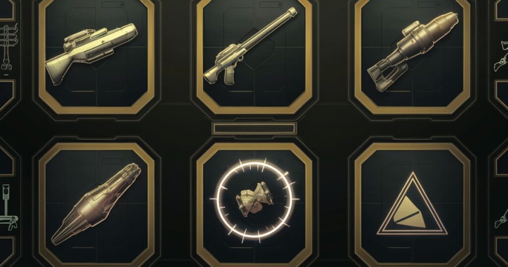
The distinction between UNSC and Covenant weaponry was a core element of Halo’s visual design, reflecting the game’s central conflict through iconography.
UNSC Weapon Icons
UNSC weapons were characterized by angular, utilitarian designs that reflected their human origin. The assault rifle icon, with its distinctive bullpup configuration, became almost as recognizable as Master Chief himself.
Covenant Weapon Icons
Covenant weapons, in contrast, featured organic, flowing designs that hinted at their advanced alien technology. The plasma pistol’s icon, with its rounded shape and energy glow, was instantly distinguishable from human weaponry.
Faction Banners
Faction banners in Halo were more than just team identifiers; they were symbols of the game’s rich lore. The UNSC’s military-inspired designs contrasted sharply with the Covenant’s ornate, quasi-religious iconography, telling a story of cultural clash through visual design alone.
Also Read: Geekzilla Radio: The Ultimate Hub for Geek Culture Fans!
FAQ’s
What are the most iconic Halo: Combat Evolved game icons?
The most recognizable icons from Halo (2003) include the MA5B assault rifle, the energy sword, the Warthog vehicle, and Master Chief’s helmet, which often served as a stand-in for the character himself in menus and promotional materials.
What role did banners play in Halo: Combat Evolved’s visual identity?
Banners in Halo served multiple roles, from setting the mood in loading screens to identifying teams in multiplayer. They were crucial in establishing the game’s sci-fi atmosphere and conveying important information to players quickly and effectively.
How do Halo 2003 icons impact gameplay?
Icons in Halo (2003) were designed for quick recognition, allowing players to make split-second decisions in fast-paced gameplay. They conveyed crucial information about weapons, vehicles, power-ups, and objectives, enhancing both strategic depth and moment-to-moment action.
How did banners in Halo 2003 contribute to the game’s narrative?
Banners in Halo 2003 were powerful storytelling tools. Loading screen banners offered glimpses into the game’s expansive universe, while faction banners reinforced the central conflict between humans and the Covenant. Even multiplayer banners contributed to the game’s overall narrative of epic, large-scale conflict.
Conclusion
The icons and banners of Halo (2003) were more than just visual flourishes; they were the building blocks of a revolutionary gaming experience. By creating a cohesive, intuitive visual language, Bungie didn’t just make a great game – they changed how we interact with virtual worlds. From the instantly recognizable weapon icons to the mood-setting loading screen banners, every visual element in Halo was crafted with purpose. These design choices didn’t just look good; they enhanced gameplay, deepened immersion, and told stories without words.
The legacy of Halo’s visual design extends far beyond the original game. Its influence can be seen in countless titles that followed, from sci-fi shooters to competitive multiplayer games. The principles of clear communication, strategic depth, and atmospheric storytelling established by Halo’s icons and banners continue to shape game design to this day.
As we look back on Halo (2003), we see more than just a groundbreaking first-person shooter. We see a masterclass in visual design, a template for effective game UI, and a reminder of the power of thoughtful, purposeful aesthetics in creating truly immersive gaming experiences. The icons and banners of Halo didn’t just represent a game; they became icons of gaming itself, forever changing how we see and interact with virtual worlds.
Explore the latest news and insights from Vibrant’s and beyond at Vibrantsvista.com

Indu Pushpa is the admin of Vibrantsvista.com, offering insights on general topics with a passion for providing valuable, diverse, and engaging content to a broad audience.
